
In this , i will discuss about the “Marks” section in tableau. See the SS how it looks like in Tableau.

Here we will continue from the last post where we discussed about the symbol maps and issues involved in it. See the SS regarding the population data using symbol map.
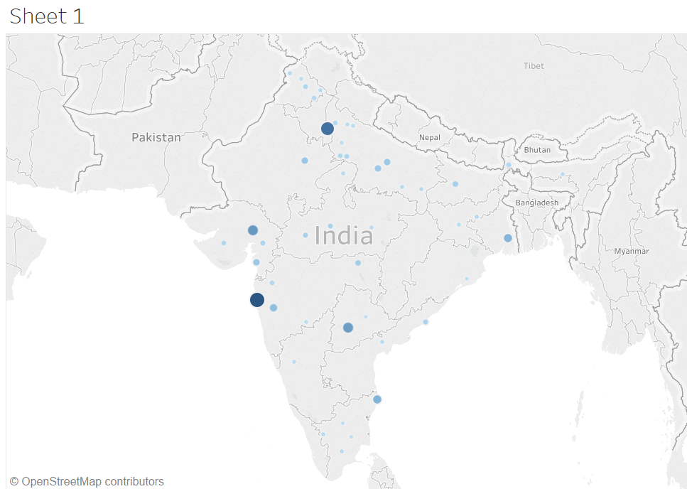
So, whenever you talk about BI tools, we says “Data Speaks” . Here the dots is not giving the user friendly information. Therefore , we will incorporate the Marks section in this map.
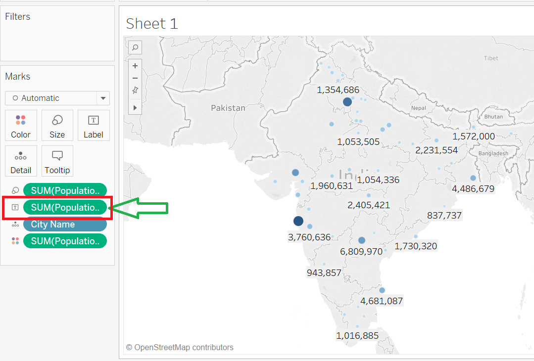
- Drag the Population Measure to Label. Once you did that, the population counts appears in the map. See the SS for the same. Here you see Sum(population) in below image for each city.
2. Now, in order to see the above population number in some units like Millions(M), then go to Label (Sum population), go to format. See the below SS for the same.
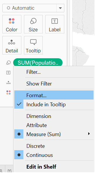
Then go to Default , Edit the Numbers Section,go to Numbers(custom),change the values of Units to Millions(M). See the below SS for the same.

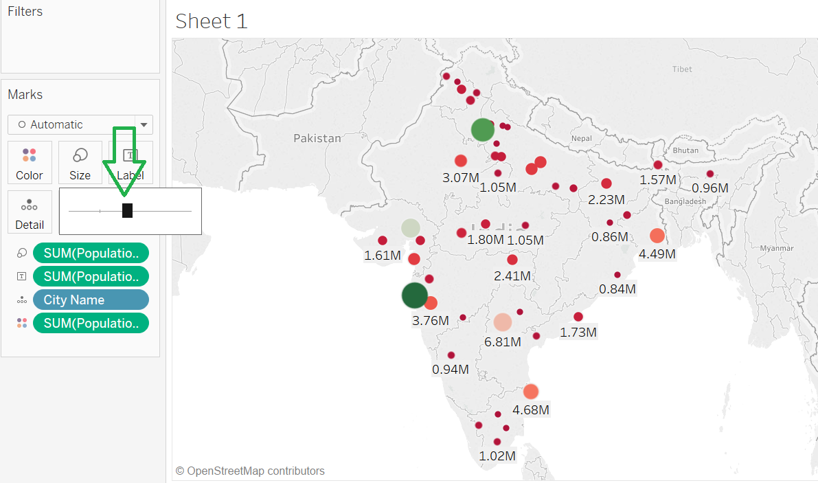
3. In order to add more colors to map, Click on colors->Click on Edit Colors->Choose Red-Green Diverging. Click on Apply and OK. See the below SS showing states in different colors.

4. From above image we can clearly convey that the size of dots is too small. So, in order to make size little more visible, go to Size->drag the size towards right. See the below SS for the same.
5. So, when you point the cursor to any state , the tooltip will show the state and count. In order to disable the same, go to Tooltip->Uncheck the “Show Tooltips”, Click OK. See “Before” and “After” images.
5.1 When Tooltip is enabled.

5.2 Disable the Tooltip.

5.3 After Tooltip is disabled.
